To expand its business and deepen its purpose of offering food quality, Go Natural created a pizzeria. The Cut stands out in the competitive food market by capturing the communal pizza-sharing experience.
The Cut is an entirely new pizza approach.
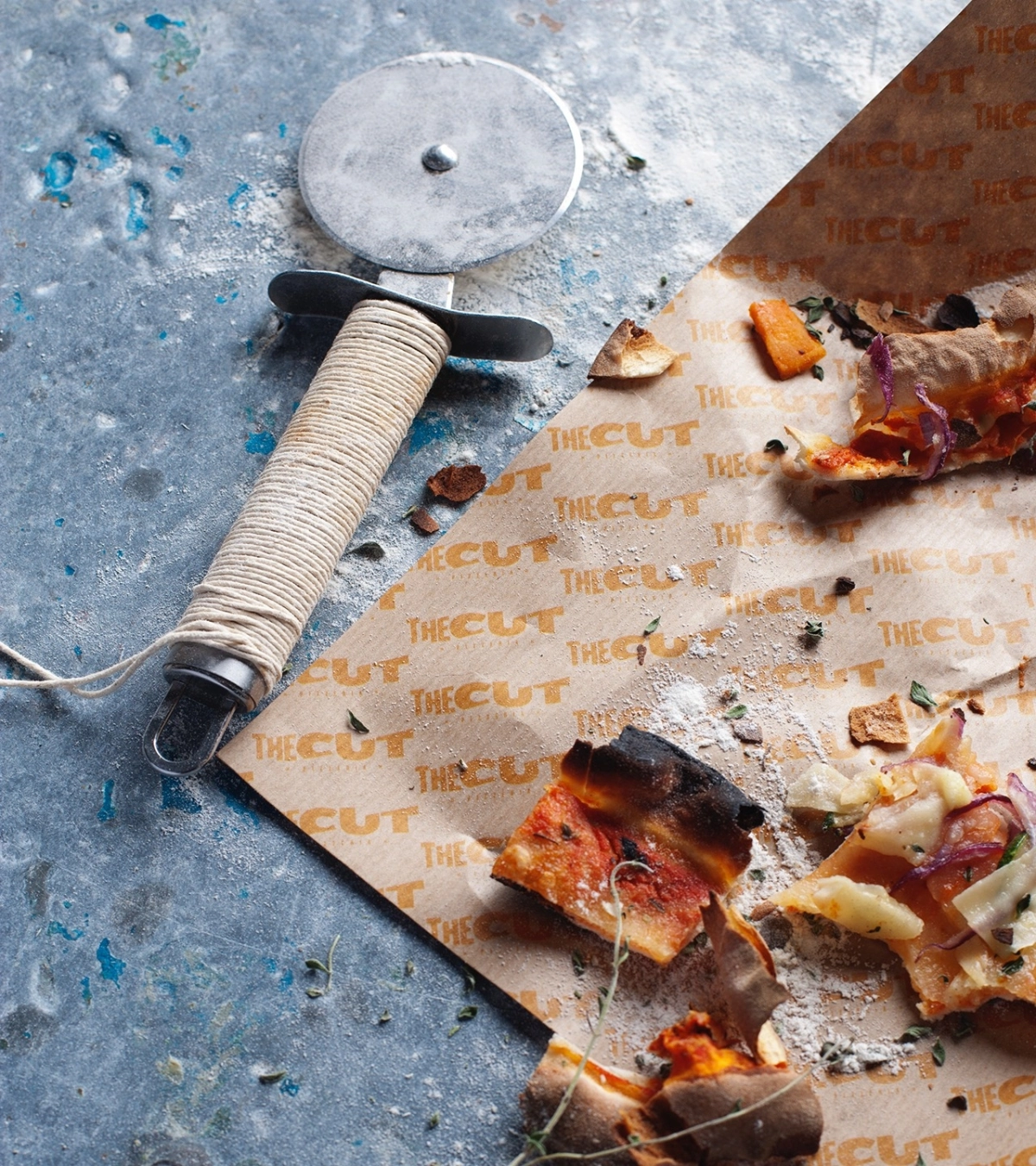
Challenge.
Go Natural, a well-established group known for its commitment to healthy and quality food, sought to expand its brand portfolio with a new concept centred around a beloved global favourite—pizza.
The challenge was to create a brand that stood out in the competitive food market and that was differentiated in a very saturated market.
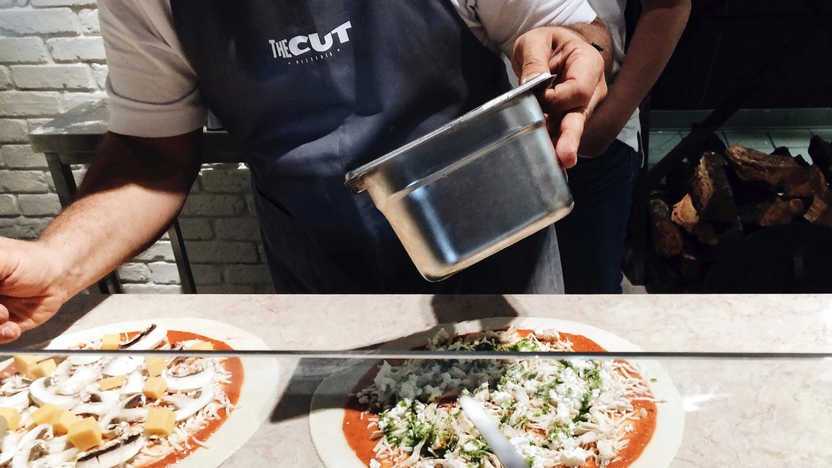
Insight.
Our journey began by delving into the core experience of pizza—specifically, the act of cutting and sharing it. We recognised that this simple yet universal ritual was at the heart of what makes pizza so unique.
The idea was to create a brand that not only reflected the act of cutting the pizza but also symbolised the sharing of food and moments among friends and loved ones.
By highlighting this ritual, we would be able to position the brand as more than just a place to eat pizza but as a brand that fosters connection and shared experiences. This insight guided the creation of a brand that is both approachable and rooted in the joy of sharing, making it a solid and enduring presence in the market
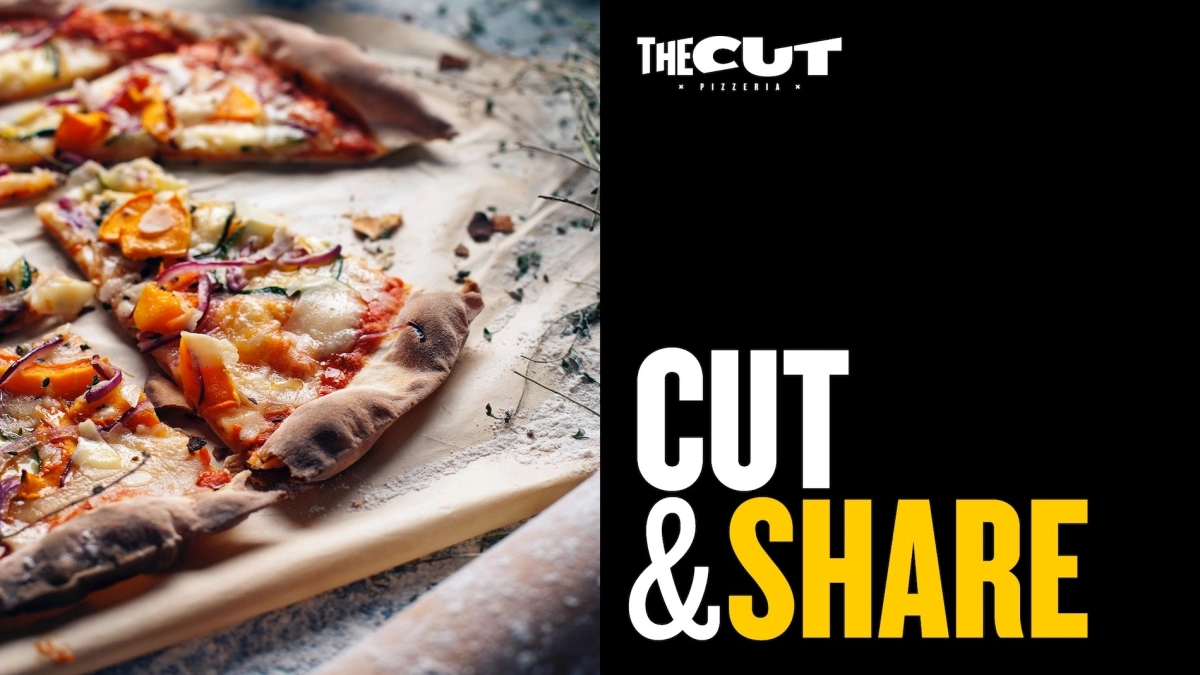
This simple yet universal ritual was at the heart of what makes pizza so unique.
Naming.
The name "The Cut" was created to directly reference the pivotal moment in the pizza experience—the slice. It evokes the action of cutting the pizza, which is synonymous with the start of sharing and enjoying a meal together, but also the cut of fresh ingredients and the words and laughter that intercut themselves.
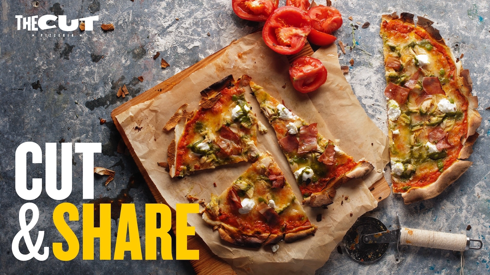
This simple yet powerful name encapsulates the brand's essence, making it instantly recognisable and closely tied to the experience it represents. The motto “Cut & Share” reinforces this.
Visual Identity.
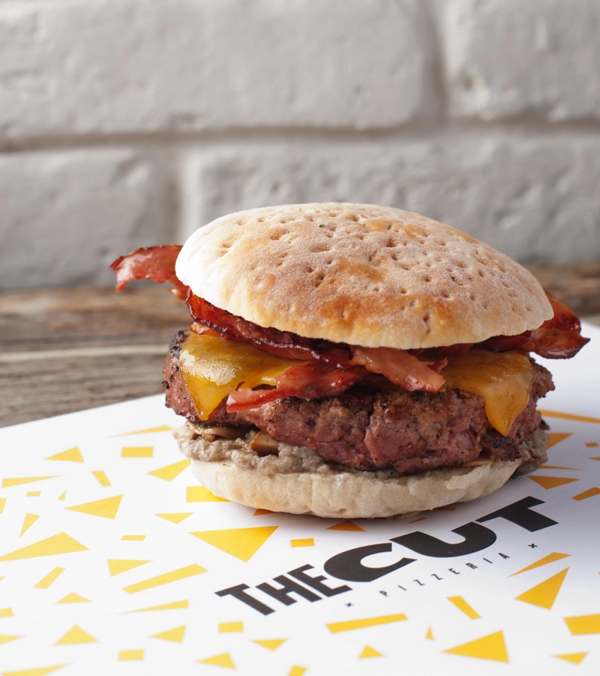
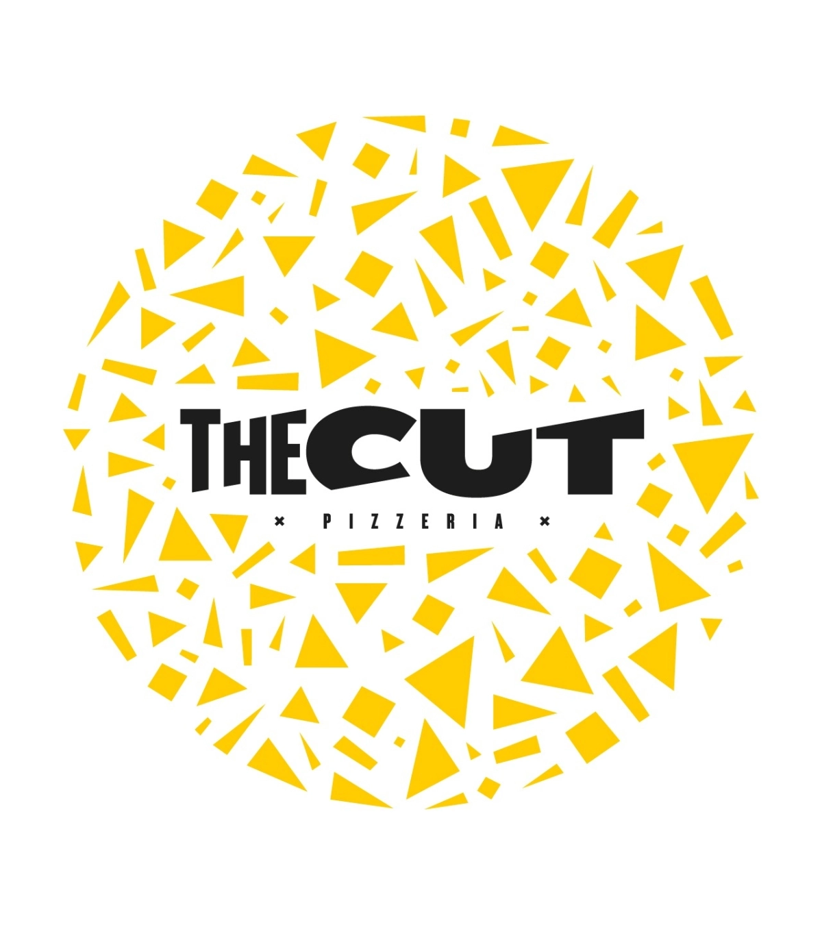
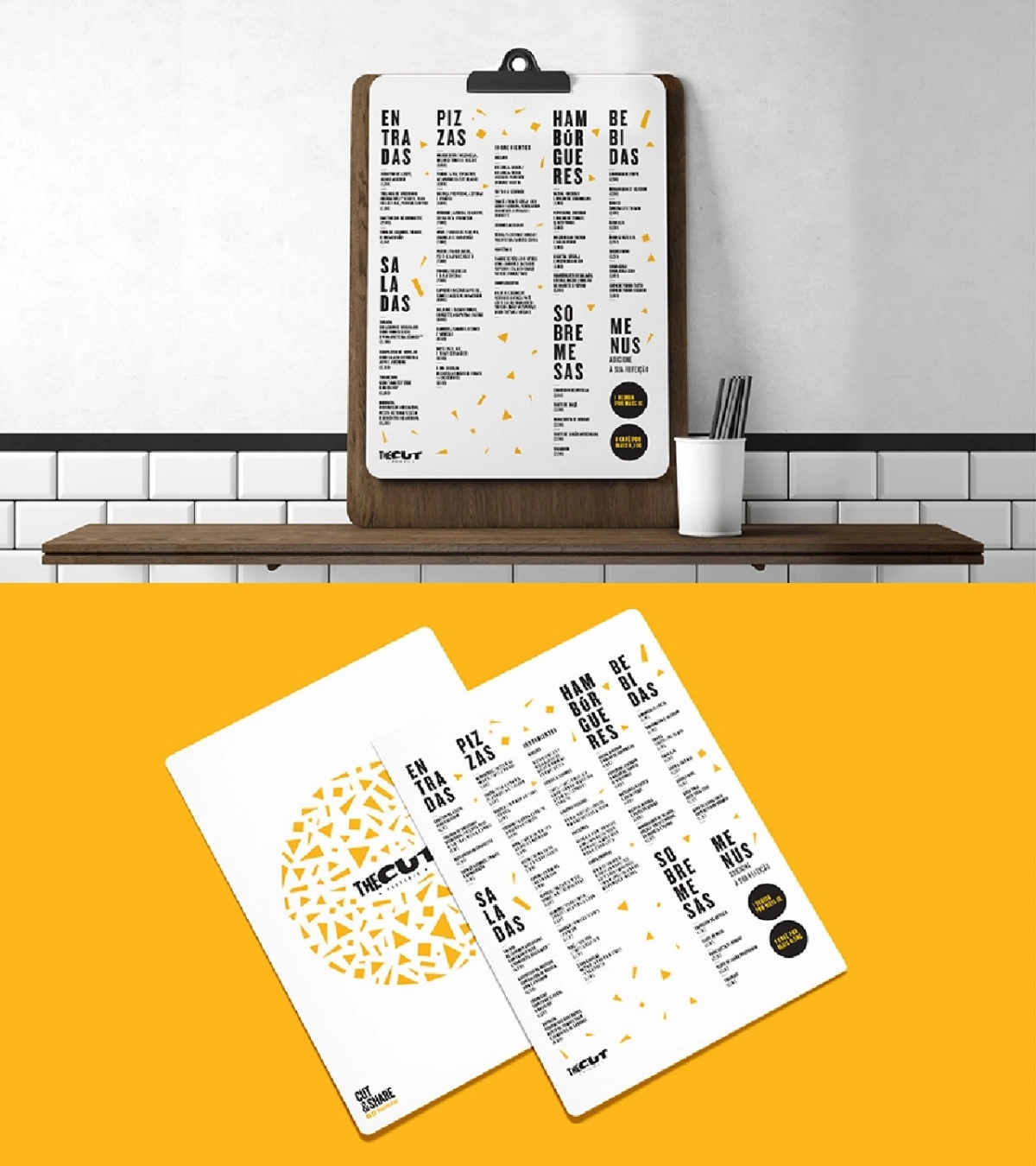
The Cut cuts the traditional language of the pizza world. Here, the triangular shape of pizza slices inspired The Cut's visual identity, and the sum of multiple triangles creates the shape of a pizza, representing its slices and moments shared with family and friends. Therefore, triangles became a central motif in the brand, store design, uniforms, and menus. This consistent use of triangles reinforces the brand's connection to pizza and creates a distinctive and cohesive visual language that is easily identifiable.
"The Cut" was created to directly reference the pivotal moment in the pizza experience—the slice.
Today.
Since its launch, The Cut has proven to be a resilient brand that has endured through time and remains relevant in a competitive market. Its robust identity and a clear focus on the ritual of sharing have allowed it to maintain a loyal customer base and continue to thrive. The brand's longevity is a testament to the power of a well-conceived and executed brand, one that taps into the emotional and social aspects of the dining experienc
The triangular shape of pizza slices inspired The Cut's visual identity.
